Branding

We see the VeritasPay logo as a representation of our team and vision, and as such, it’s
important that there’s accuracy and uniformity with how our logo is used.

Know more by downloading our branding guidelines.
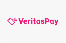
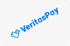
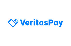
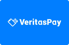
Our Logo

Our logo shows a mobile phone, QR code, and EMV chip, which are then tilted oppositely to form a “V" for VeritasPay. Fittingly enough, it also appears to be a card being inserted into a payment terminal or mobile phone.

Our Colors

Our primary color is blue and uses Azure as the main hue.
Blue represents stability, trustworthiness, and intelligence - the same qualities that we want clients to see in us and our solutions.

Our Fonts

Main typeface: Roboto

Roboto is applied on our website, payment software, and all other marketing collaterals. We also used it in our company logo and made slight modifications on some of the letters' edges to create a distinction.

Secondary typeface: Poppins

Poppins is used for instances wherein Roboto may not be applicable.

Logo Alterations

To keep the consistency of our brand and official logo, we take note of these guidelines:

Do not use an image as a background

Do not change the color

Do not rotate

Do not distort or warp in any way

Do not apply any gradient

Do not put any filter

Do not add a shadow or stroke

Correct Alteration

Azure blue logo with white background

Azure blue logo with light gray background

White logo with azure blue background

White logo with dark background